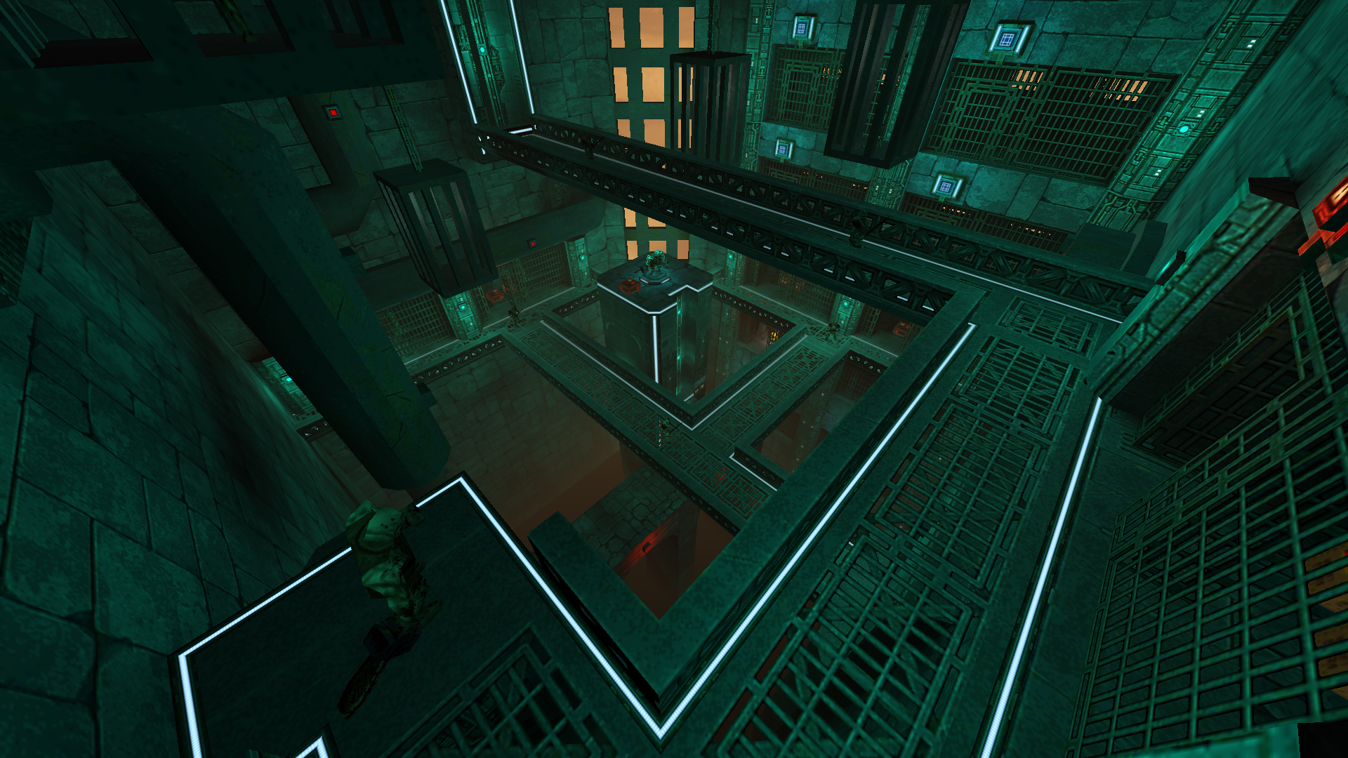
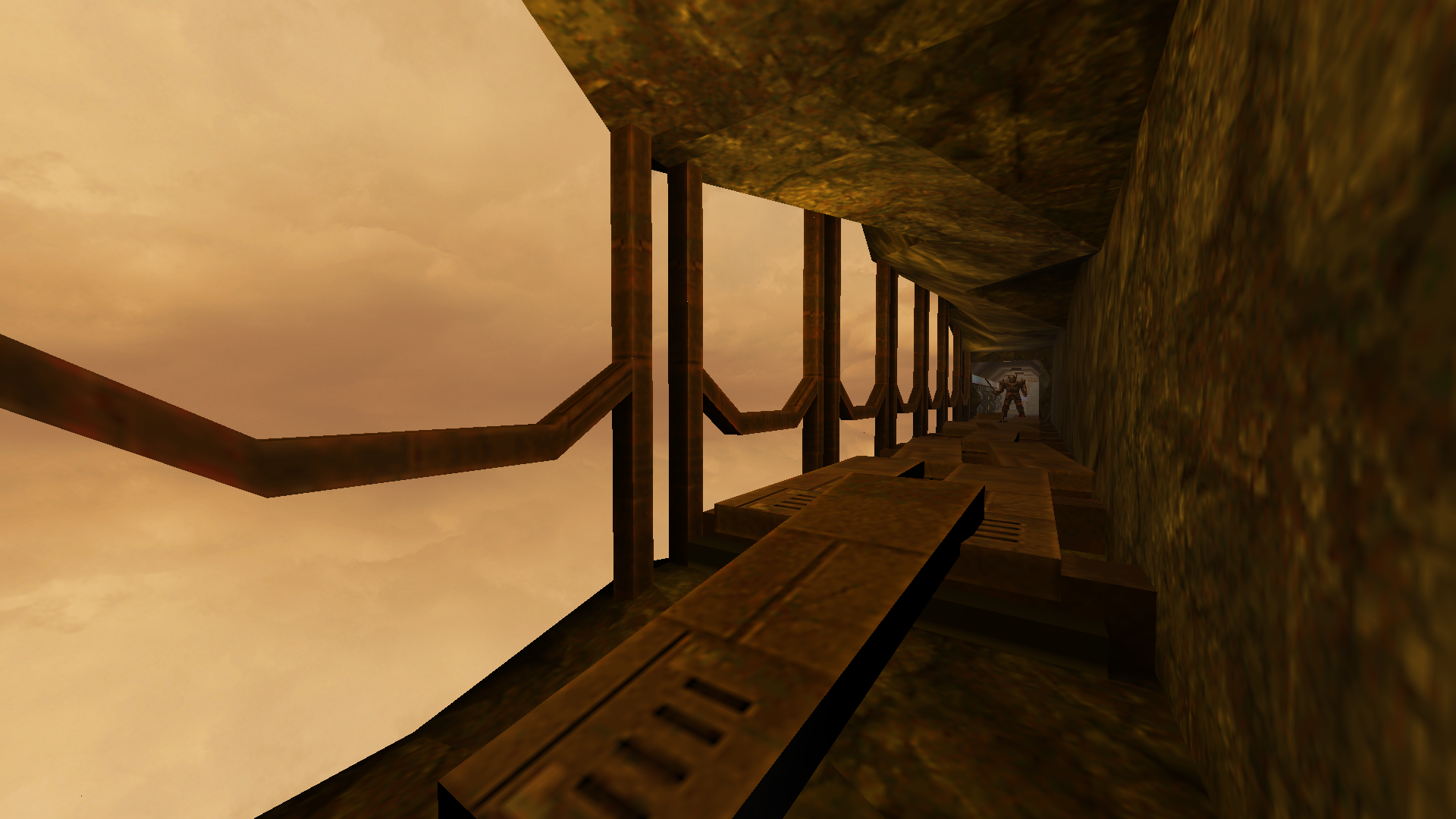
Excellent use of color, scale, and shadow. A big jump from your previous map -- and just compared to other maps in general, a unique and strong look. I really enjoyed just seeing what was next in the visuals from room to room while going through this.
Usually good texture selection too, although one of the few visual errors here comes from the use of some textures with quite different scaling, so that the pixels are almost invisible on some textures but huge and blocky on others. Also a couple of movers/lifts have pitch-black lighting issues on the "covered" parts (these are annoying to fix but can be taken care of usually one way or another).
Anyway: great look! One of my favorites this year.
The theme and mild storytelling was also fun, making use of some nifty environment designs. Pretty bold choice also to have a "bad ending" possible in a Quake map.

I do wish you had gone with a custom music track BTW, it would have really sold your setting!
The combat encounters were sparse at times yeah (skill 2). While there were at least a couple of areas that did get my pulse up a bit, on the whole I'd say that the fighting was the weakest aspect of the map. If the experience here included some truly punchy combat setpieces, it could be an instant classic.
Still feels like a 5-star despite my quibbles, because I _really_ liked the visual vibe.


