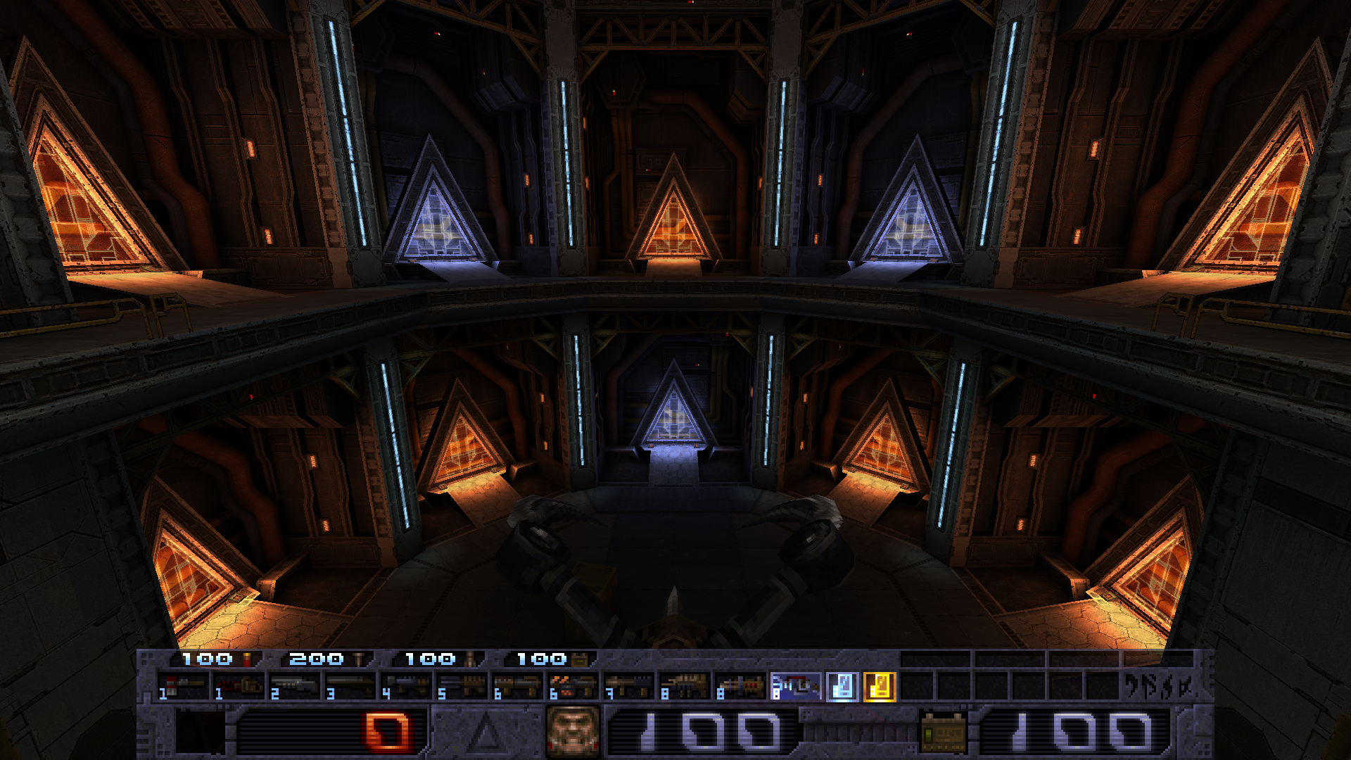
Ok, some thoughts on this. First, as Aleks said, there isn't any recurring color or theme in the pack's maps. Each has their own identity, and in fact for the main hub maps we wanted each map to use a different themed wad.I'll explain, here I quckly bashed together some screenshots to show what I see when playing the mod. And I see that most of the maps have orange/brown color palette, so hud, menu and console fonts with its blue color feels out of place on the screen when player loads 70% of maps.
So I think some kind of orange color scheme would fit for the mod better at this stage. Here is some mockup I made. I think hud should be closer to the original quake theme, but not brown, rather somewhere between orange and yellow, kind of like color Half-Life's pseudo-VFD display hud has. Just throwing ideas here. I realize that many people like original blue color scheme, so probably it is possible to make these two interface color schemes interchangeable in the options. I've already seen it in SlayerTest quake mod, where player can change hud style in the settings.
But even if it the maps were majorly orange-colored, it'd still look good because blue and orange are actually complementary colors and go very well together - that's one of the reasons why the portals in the start map turn from orange to blue for example, they give off a very good contrast next to each other.
And the whole theme of the mod draws to blue hues. The own Alkaline logo is in a neon-bright, blueish-white tone.
And no, we don't think the HUD should be closer to the original Quake theme. That's why we made a custom HUD, menus, fonts, and a whole distinct visual identity in the first place. Quake is medieval and brown, and that doesn't go along well with a techbase-focused mod.